Before
The banner disappeared permanently, even if the person was interested but needed to postpone their response.
Case study · Tiendanube admin
How a microcopy and behavior iteration on an in-app banner increased participation in the annual survey for the NubeCommerce report.
increase in CTR on the CTA to complete the survey.
total consolidated responses in the report survey.
critical window before the survey closed.
Situation
Every year, Tiendanube publishes NubeCommerce, its annual ecommerce report. To build the 2025 edition, we combined:
With 15 days left before the deadline, the survey already had a usable base, but the team wanted to expand the sample to strengthen the reading of trends and improve the report's representativeness, both for small businesses and larger mid-market brands.
Task
The invitation to respond was being sent by email and through a banner in the store admin panel. The problem was that if someone closed the banner because the moment was inconvenient, they would not see it again.
The hypothesis was that many people might be willing to respond, just not at the exact moment the communication appeared. The task was to reframe the touchpoint so the invitation stayed available without becoming invasive.
Action
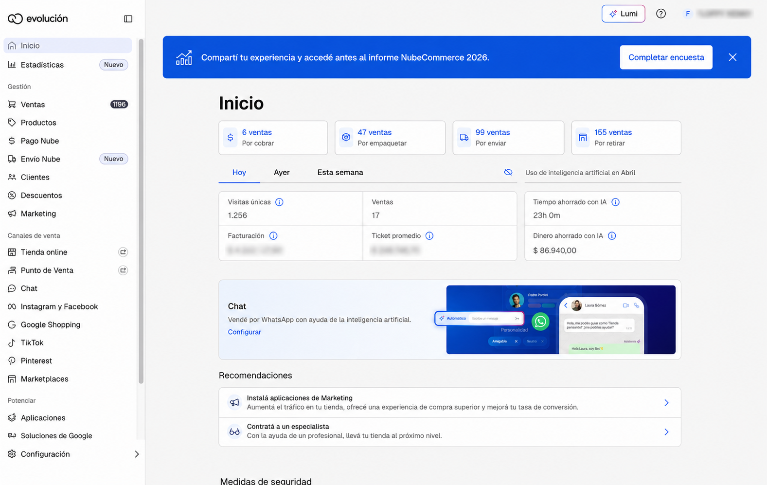
Instead of relying on a dismissible appearance, I proposed leaving the invitation fixed as a header inside the admin during the final survey window. The content needed to be clear, direct, and contextual enough to explain why it was worth participating.
The banner disappeared permanently, even if the person was interested but needed to postpone their response.
The invitation remained available during the critical period, with a visible CTA and a hierarchy designed to support day-to-day work.
Result
The iteration achieved a +60% increase in CTA CTR to complete the survey. After three weeks with around 1,900 responses, we reached 3,773 total consolidated responses in the report within 15 days.
This case shows a small decision with real impact: it wasn't just about changing words or sending more emails, but about adjusting content, timing, and interface behavior to match users' real availability.